
The Silent Language of Serenity: How Color and Art Heal the Mind
In a world that often feels like a relentless barrage of notifications and high-velocity demands, our homes have become more than just shelters—they are our emotional recharging stations. While we often focus on ergonomics or organization to reduce stress, one of the most potent tools for mental well-being is often hiding in plain sight: color.
The way we perceive color isn’t just a visual experience; it’s a biological and psychological one. By understanding the "why" behind color theory, we can use artwork to curate a space that doesn’t just look good, but actually lowers our cortisol levels.

The Science of a "Calm" Palette
Why does looking at a clear blue sky or a rolling green meadow feel like a deep exhale? It comes down to Evolutionary Psychology.
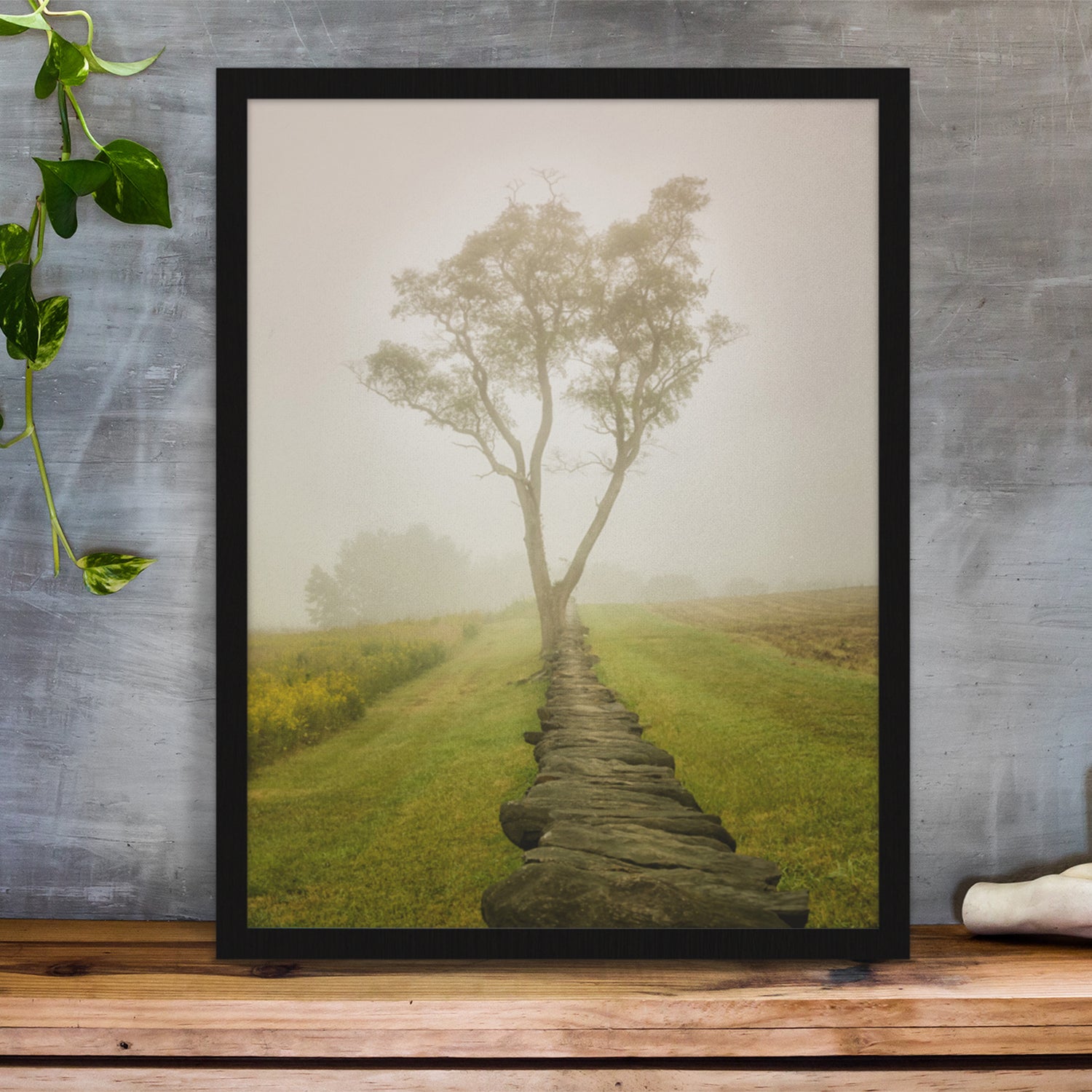
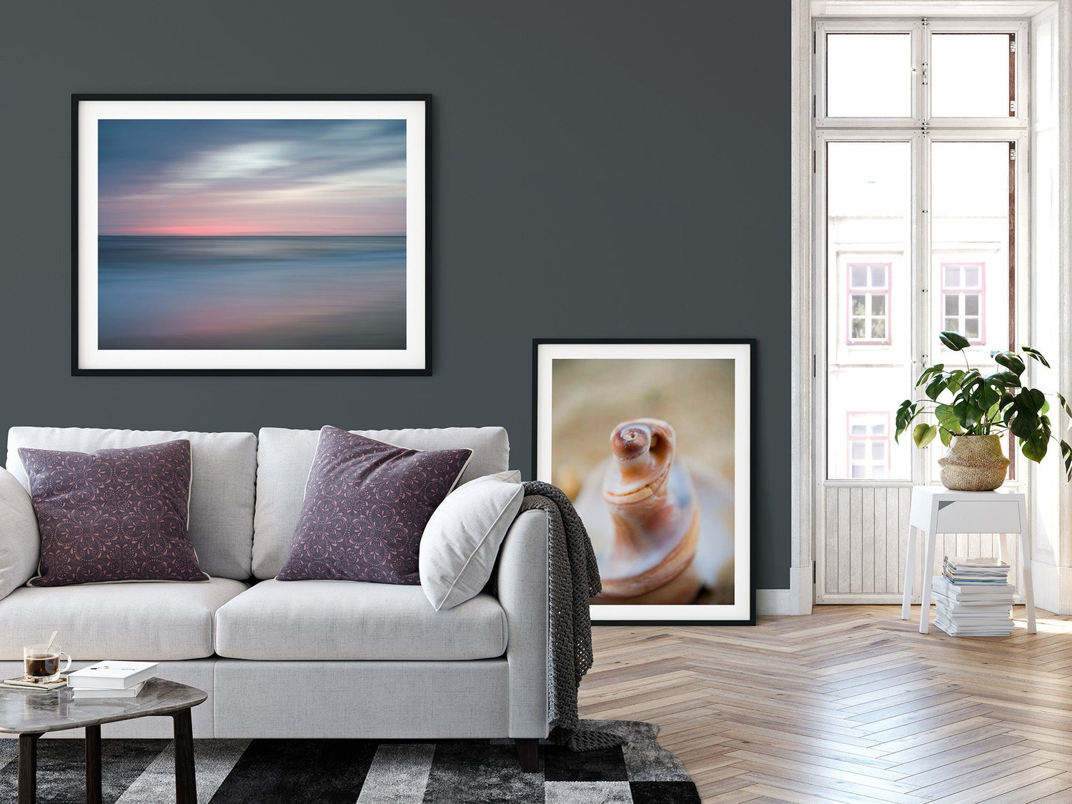
- Cool Tones (Blues and Greens): These are the heavy hitters of relaxation. Blue is universally associated with the ocean and the sky—vast, stable, and constant. Physiologically, exposure to soft blues has been shown to lower heart rates and even reduce blood pressure.
- The Power of Green: As the color of nature, green signals "growth" and "safety" to our primitive brains. It occupies the center of the visible spectrum, meaning our eyes require very little adjustment to see it, which reduces visual strain.
- Neutrals and Earth Tones: Beiges, soft taupes, and "greige" provide a stable foundation. They act as visual silence, allowing the brain to rest without the "noise" of high-contrast patterns.

Artwork: The Window to Emotional Regulation
If color is the "mood," then artwork is the "narrative." A solid blue wall is soothing, but a piece of art that utilizes blue can transport the viewer. Artwork plays a specific role in calming the mind through three key mechanisms:
- Soft Fascination Psychologists describe a state called "Soft Fascination"—a type of attention that doesn't require effort. Looking at a painting of a landscape or an abstract piece with soft, fluid transitions allows the mind to wander. Unlike a scrolling feed that demands "Hard Attention," art lets your brain's "Default Mode Network" kick in, which is essential for creative recovery and stress reduction.
- Fractal Patterns Nature is full of fractals (repeating patterns at different scales). Research suggests that viewing art that mimics these natural geometries—think Impressionist paintings or organic sculptures—can reduce stress by up to 60%. These patterns are "easy" for our brains to process, creating a sense of order amidst chaos.
- Intentional Focus In a state of anxiety, our thoughts are often fragmented. A compelling piece of art provides a singular point of focus. By examining the brushstrokes or the depth of a specific hue, you are practicing a form of "external mindfulness," pulling yourself out of a spiral and into the present moment.


Tips for Curating Your Calm
If you’re looking to transform a high-stress room (like a home office or bedroom), consider these artistic choices:
- Prioritize Low Contrast: Look for pieces where colors bleed into one another gently rather than clashing.
- Avoid "Aggressive" Geometrics: Sharp, jagged angles can trigger a subtle "alert" response. Opt for curves and organic shapes.
- Mind the Saturation: A bright, neon blue might be "cool," but its high intensity is stimulating. For calm, look for "muted" or "dusty" versions of your favorite colors.
Final Thoughts
We don’t just see art; we feel it. By intentionally choosing pieces that lean into the restorative power of cool palettes and natural forms, we turn our living spaces into a sanctuary. Color is the tool, but art is the bridge to a quieter mind.